Back in 2019, Xbox decided to hop on the trend of a “simplified logo” like most other companies at the time were. They got rid of the classic green logo that Xbox was known for and replaced it with a generic black and white version of the Xbox logo.
Xbox has always been associated with the color green, so the decision to change their logo from green to black and white always confused me. However, the company recently got a new ceo who has made a number of large changes to the company. One of which is yet another redesign of the logo.
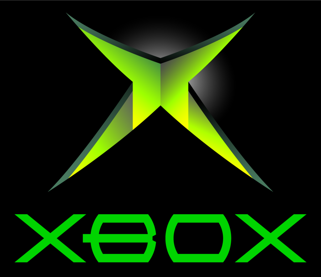
The new logo bears Xbox’s iconic green color once again. The circle is a dark green while the x and background remain black. This new logo is an inverse of the original xbox logo from back in 2001 which had a black circle and green x and background.
The change in Xbox’s logo hopefully marks a bright future for Xbox. The past decade has been pretty rough for Microsoft and Xbox. There haven’t been very many Xbox original games released, and the pr for the company has also gone downward due to many poor choices within the company, but the new ceo and logo could be the start of a great future for Xbox.
Leave a Reply